Transformation Tiles
About This Project
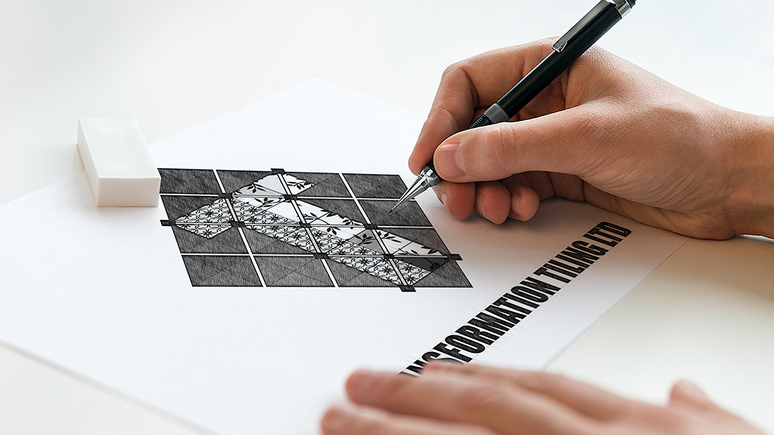
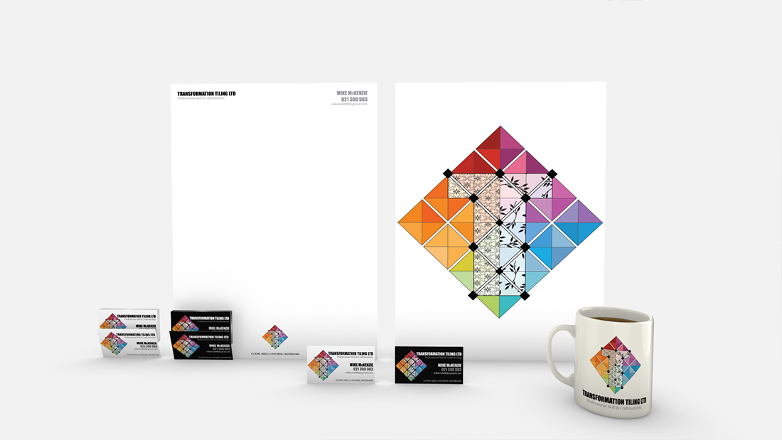
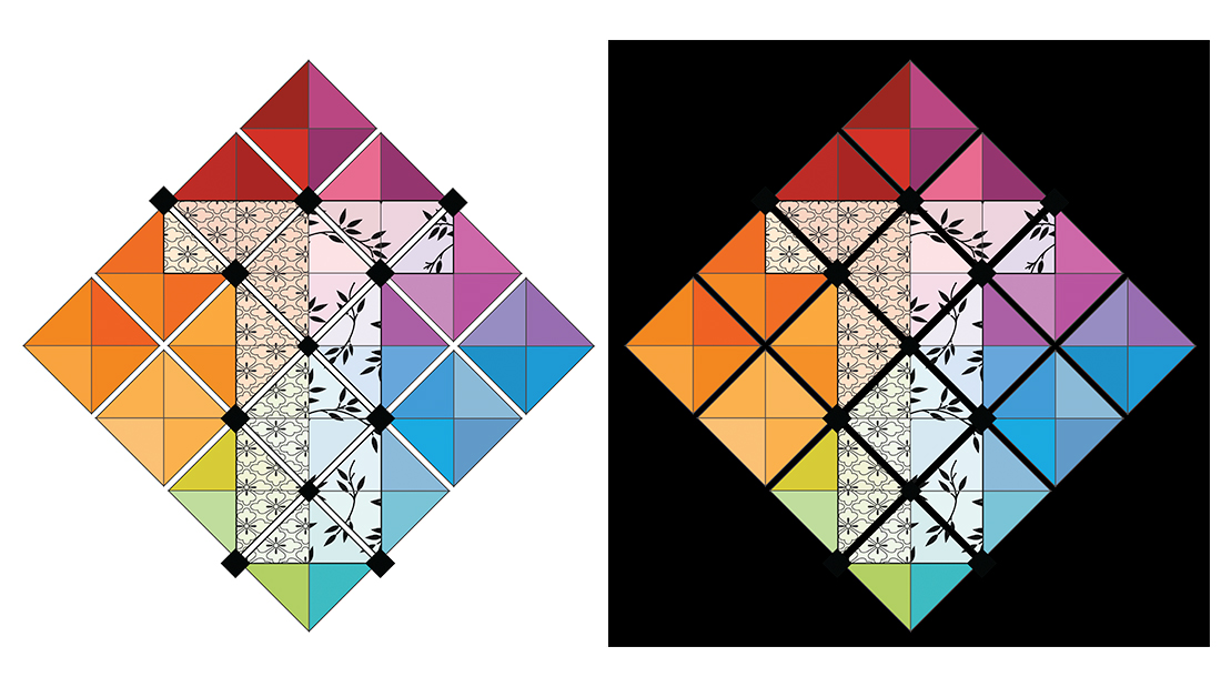
Transformation Tiles had made up a quick business card using Vista Print and their standard artwork. Mike tiled my house, and when I saw the high professional craftsmanship that his work showcased, I felt that he needed a logo that matched his attention to detail. I set about designing a logo that incorporated all the principles of Tiling, from colour range to patterns. I divided the “T” in half to maintain the name of his company and accented this by placing separator pegs used in tiling to confirm this division. The result was something I believed reflected Mike from every angle.
Client Brief
Design a Logo
Design Business Card
Design Stationary
Date
September 15, 2016


